I see confusion in the market about 2025 color trends. People worry about matching real nature with Pantone’s new hue. I will solve this puzzle today.
Pantone’s 2025 Color of the Year signals a blend of harmony and innovation. In my experience, pairing that bold hue with earthy or vibrant tones creates visual balance. This approach helps artificial plants echo natural elements while reflecting modern design sensibilities in both homes and commercial spaces.

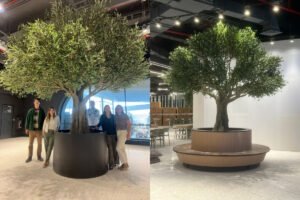
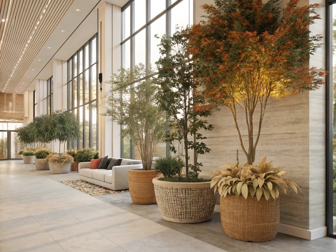
I recall my first attempt to apply Pantone’s Color of the Year in a project. I noticed how a single accent shade transformed the entire display of artificial trees and plants. Now, I want to reveal how these vibrant Pantone hues can elevate your botanical designs.
How Will Pantone’s 2025 Color of the Year Shape Nature-Inspired Faux Botanicals?
People worry that artificial plants might look stale. I see a chance to use Pantone’s 2025 hue to give them life. I plan to tackle this hesitation.
Pantone’s bold color can guide new design ideas for faux botanicals. It inspires leaves, stems, and floral accents to feel aligned with nature. It also boosts a space’s vibrancy and freshness.

Many people assume that artificial plants cannot mirror the subtle shading found in natural greenery. However, I have discovered that Pantone’s 2025 Color of the Year can guide color matching in new ways. This color becomes a focal point that helps leaves and petals reflect real-life gradients. The biggest revelation for me was that I could choose textured materials that pick up small hints of Pantone’s hue without overpowering the design.
Importance of Consistency
I believe that a consistent color palette ties the entire display together. When you integrate Pantone’s main hue into the leaves, you need to maintain supportive accent tones in the stems and veins. This approach grounds your design.
Practical Ways to Incorporate Pantone’s Hue
I like to break the process down in a simple table:
| Step | Action | Outcome |
|---|---|---|
| 1 | Identify Pantone’s 2025 color in your plan | Clear color direction |
| 2 | Pick complementary shades for accent leaves | Balanced look and feel |
| 3 | Use subtle patterns for stems or petals | Adds realistic depth |
| 4 | Test multiple samples under various lighting | Ensures consistent harmony |
This table helps me keep track of each step. It also prevents me from adding random colors that break the flow. I have seen how careful color planning yields artificial displays that feel more organic. The outcome is always a more vibrant and modern look that stays connected to nature. Sometimes, I let clients test different pantone-driven leaves next to natural lighting. They notice how the color interacts with shadows and highlights. This process helps them see the potential of subtle adjustments.
Can Natural Textures and Pantone Hues Redefine Artificial Greenery in 2025?
Some experts doubt that synthetic leaves can match nature’s feel. I think Pantone’s future color forecasts can blend with rough or smooth textures for a realistic result.
Natural textures pair well with Pantone’s 2025 palette. Combining subtle ridges on leaves with a bold color helps replicate real plants. This mix elevates the authenticity and appeal of artificial greenery.
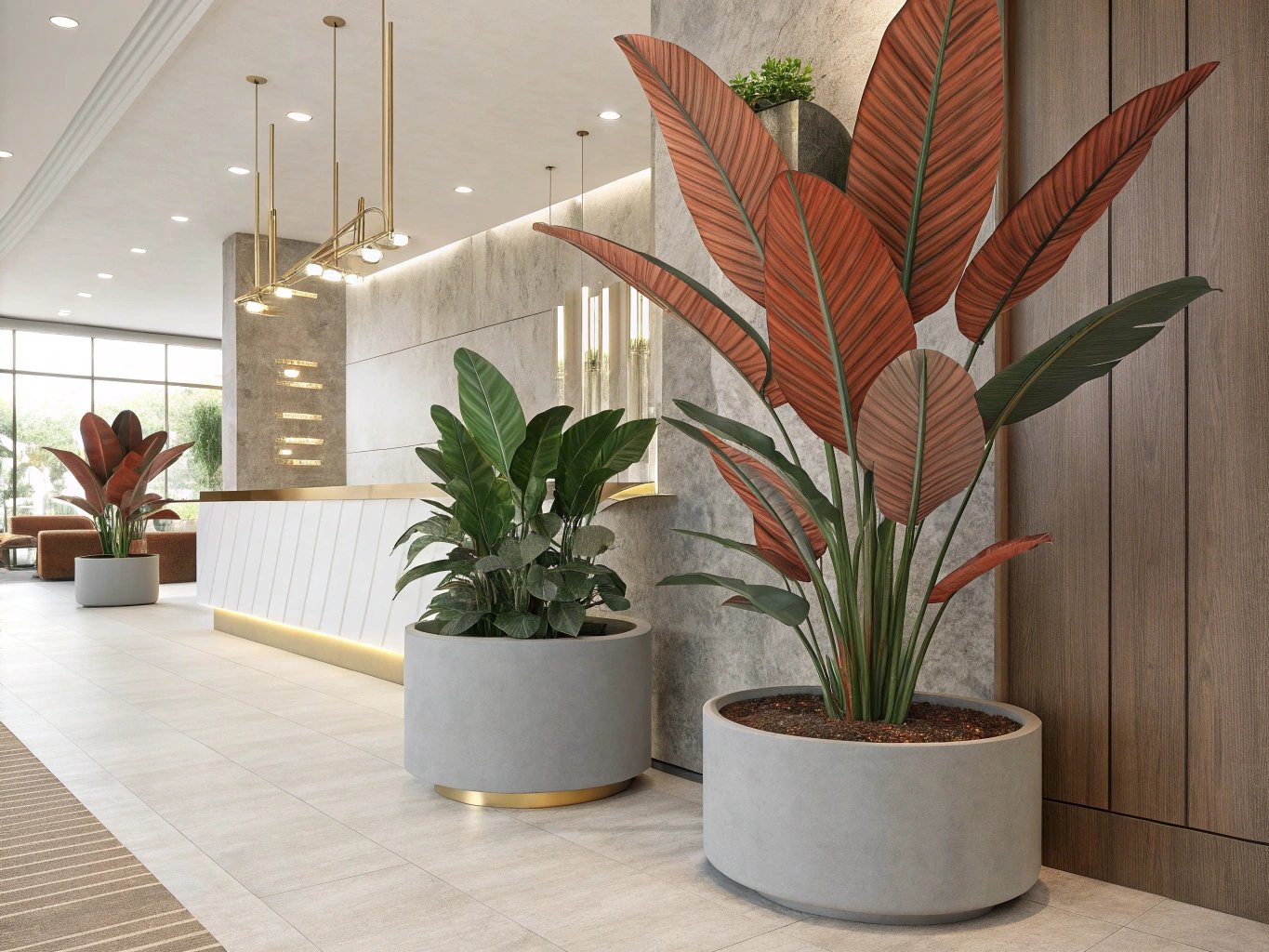
I have spent many hours testing fabric leaves and plastic stems. I noticed how texture changes the way color reflects. When Pantone predicts a vibrant shade, it can look different on glossy surfaces versus matte or flocked finishes. This variance can be a challenge, but it also becomes an opportunity to imitate nature more closely.
Balancing Color Intensity
I discovered that overly bright hues can appear cartoonish on certain artificial fabrics. But if the material has a slight texture, the color seems softer. This creates a natural vibe.
Combining Textures with Pantone’s 2025 Hue
I usually start by picking a base texture that mimics real plant veins. Then I layer the Pantone color in smaller sections. For example, if the color is bright, I add it near the leaf edges, where real plants might have a color transition.
I also value the role of microtextures in adding depth. Small grooves on stems or raised spots on leaves give the color more dimension. People often think of texture as a purely visual element, but I find that the tactile aspect matters too, especially when a client handles a sample.
When I tested these ideas in my showroom, potential buyers noticed the difference immediately. They said the textured leaves looked more alive. That feedback convinced me that combining Pantone’s boldness with nuanced surfaces is key to redefining artificial greenery in 2025 and beyond.
What Makes Pantone’s Forecasted Palette Perfect for Eco-Chic Simulation Plants?
Many wonder if Pantone’s forecasted palette can really match eco-chic styles. I believe it can. I want to resolve this uncertainty by showing how vibrant colors enhance green designs.
Pantone’s bright palette aligns with eco-chic principles when used thoughtfully. Blending these colors with neutral bases creates harmony. This synergy showcases the plant’s shape and detail while honoring a modern, eco-conscious style.

I have seen many people assume that eco-chic decor must stick to greens and browns. But Pantone’s forecasted palette can expand this notion. A pop of bright color does not diminish a design’s eco-friendly feel. Instead, it draws attention to the plant’s form and sustainable focus.
Adding Contrast to Emphasize Green
One key idea I follow is pairing saturated Pantone colors with subdued greens. This contrast makes the foliage stand out. It also reminds onlookers that the design is about nature at its core.
Subtle Neutrals for Balance
Eco-chic does not mean ignoring neutral tones. I often use cool grays or soft beige as a backdrop. This anchor allows the brighter Pantone shade to shine without overwhelming the plant.
I remember a project where I combined a deep Pantone accent color with a simple green succulent arrangement. The addition of that accent shade made the greenery appear more dynamic. Clients asked if it was a live plant because it looked so fresh. That experience confirmed my belief that thoughtful color choices can maintain an eco-chic feel while adding flair.
I also think that small touches of metallic or earthen hues can tie everything together. For example, a subtle metallic pot can reflect the Pantone shade in the leaves, giving the arrangement a cohesive look. This approach underscores the idea that eco-chic is not just about dull or muted colors. It is about balance, intention, and connecting vibrant modernity with the timeless appeal of greenery.
Are Earthy Tones and Pantone’s Bold Picks the Future of Synthetic Flora Design?
Some designers say earthy tones are outdated. I think they remain critical, especially when blended with Pantone’s bold picks. I want to address doubts about this powerful combination.
Earthy tones bring grounding qualities to synthetic flora. When fused with Pantone’s bold choices, they create an engaging visual mix. This union reflects nature’s balance and propels faux plant design forward.
I used to think that earthy tones were too simple for modern artificial plant displays. Over time, I realized these muted browns, tans, and soft grays offer a solid stage for more vibrant Pantone highlights. They act as the background that makes bold colors pop.
Combining Warm Earth Tones with Cool Pantone Shades
I often experiment with warm browns or beige leaves combined with Pantone’s cooler tones. This contrast surprises many people. They expect everything to be either fully warm or fully cool. But nature itself is full of contrasting elements.
Emphasizing Realistic Variation
In real forests, not all leaves are uniformly colored. Some are dark green, some have browns near the edges. By mixing earthy hues with Pantone’s bright picks, I mimic nature’s variety. That means adding subtle brown tints to leaf stems or shading leaf centers with deeper tones. This layered approach lends realism to the display.
I remember one of my early projects where I used a bold Pantone color on the outer edges of the leaves, fading it into a warm brown center. At first, I was unsure. However, the final product felt natural. Visitors even asked if we had used dried leaves, which shows how earthy tones can enhance authenticity.
People sometimes overlook how crucial earthy tones are in design. They stabilize the overall color scheme. When you add Pantone’s accent colors, these earthy bases keep the arrangement from feeling chaotic. That is why I see earthy tones and Pantone’s bold picks as a future-ready pairing in synthetic flora design.
Why Blend Organic Inspiration with Pantone Trends for 2025’s Faux Plant Aesthetics?
Many feel overwhelmed by endless design possibilities. I see Pantone’s 2025 trends as a guide that merges well with organic inspiration. I plan to resolve this confusion right now.
Blending organic inspiration with Pantone’s color direction fosters a balanced faux plant aesthetic. This approach fuses nature’s timeless appeal with fresh modernity. It allows artificial flora to look both trendy and authentic.

I often look to real forests, gardens, and everyday plant life for inspiration. Pantone’s annual trend forecasts, on the other hand, capture the mood of global culture. Blending these two worlds brings a dynamic result that resonates with people who value both style and nature.
Emotional Connection
When I apply an organic approach, I think about the sense of calm or wonder that real plants evoke. Pantone’s color choices for 2025 often reflect a global desire for renewal and fresh perspectives. By merging these elements, artificial plants can speak to deeper human emotions.
Practical Applications in Faux Plant Design
I start by selecting a core palette based on Pantone’s highlights. Then I add natural details like leaf texture variations or realistic color transitions. For instance, if Pantone suggests a vibrant blue, I might incorporate subtle blue-green hints in the leaf veins or stems. This nod to a real-world phenomenon helps the design feel authentic.
I remember when I first experimented with combining a Pantone-inspired shade of purple with lush, green leaves. That mixture popped with energy, yet it still felt grounded. Clients reported that the arrangement gave the space a unique personality. They said it reminded them of a tropical location, yet it fit seamlessly in a modern setting.
For 2025, I see continued interest in bridging technology-driven color forecasts with the timeless allure of nature. Organic shapes, subtle color transitions, and thoughtful textures will keep artificial plants looking more genuine than ever before.
Conclusion
Pantone’s 2025 colors, when paired with nature-inspired elements, promise stunning artificial plant designs. This blend of modern and organic sets the stage for realistic, vibrant faux greenery in any setting.